The World of Wayfinding in Austin
How we get from here to there in our ever-changing city
By Mike Clark-Madison, Fri., Jan. 31, 2020


"I don't know where we are. Do you?" asked my seatmate on the ACL Fest shuttle bus last fall just after we'd crossed back into Downtown. She had just moved to Austin, I'd already overheard.
I leaned over to look. "Huh, I'm not sure either. None of this used to be here."
"Before this morning?" she laughed.
"No, when I first moved here," I said. That was in 1988, likely before my new friend was born, but I skipped that part.
Where we were – West Avenue just north of Cesar Chavez – did not exist then, in the space between the old power plant and the old water plant. I found myself a better angle and then could see the two big monument signs, facing each other, marking our place today – SEAHOLM on the one side, LIBRARY on the other.
Between the speed at which Austin's population has both grown and changed, and the pace at which the old urban fabric is made anew, our town is rich with places that Didn't Used to Be Here for somebody. And for most people most of the time, our individual experience of a place is not purely logical – not as simple as "If I've been here before, then I know where I am." Many times, it's more like ours on the ACL Fest shuttle; we'd both been in that exact place only a few hours earlier, yet neither of us could recognize it. Neither of our mental maps, different as they were from each other, included that place, in that situation, from that perspective, at that moment.
It is admittedly a little embarrassing to me, and probably pretty hilarious to others, that I'd find myself "lost" in between Seaholm and the New Central Library – two projects with which I have some personal history and also wrote about in these pages quite a bit. When one thinks about how to help people find their way through and about Downtown's new southwestern corner, there are several tiers of users above me whose needs would take precedence. If I get lost, it's my own problem.
As new places are continuously being made, the design discipline of wayfinding – providing the system of cues and tools that we each need to get from a Point A to a Point B – is called upon to help the naive users that are also continuously being produced. These might be tourists or conventioneers Downtown or at the airport, or patients navigating the often confusing interior and exterior environs of a hospital, or prospective employees arriving at a corporate office complex. Or, like my shuttle bus companion, simply people who are new in town, doing Austin things.
In some such cases, perhaps any combination of signs and maps and apps might do, and maybe other cues, like coding the floors of a parking garage. Such practical tools could be enough to get a naive user from a Here to a There, even if no "design" is applied to them – how we often do things ad hoc for one-off events like a garage sale or church committee meeting, with hand-drawn maps and laser-printed signs taped on glass doors and light poles. But even as naive users, we grasp the value of well-considered, well-executed design as an aid in finding our way in unfamiliar places that don't correspond to our mental maps. Indeed, as the Society for Experiential Graphic Design describes it, wayfinding systems "help people develop their 'mental maps' of the terrain and simplify their routes to the extent possible."
Some of the tools and techniques of wayfinding work precisely because we as users have seen them before – we come to an airport – but much of the discipline engages us at levels that are more intuitive, or at least shaped by the ways we learned to understand space, dating back to infancy. As toddlers, we greet unfamiliar spaces with wonder but also with fear. As we age and discovery becomes less often an end in itself, the wonder goes away and the fear hardens into stress, amplified by the other stresses endemic to that place (like being sick at the hospital) or our reason for being there (like having millions of dollars on the line on a business trip). "In these often high-stress environments," again in the words of SEGD, "effective wayfinding systems contribute to a sense of well-being, safety, and security."
Wayfinding solutions are exercises in information architecture, just as surely as is the (re)design of this newspaper or that of a website, and they communicate an information hierarchy that is expressed almost exclusively as a series of design decisions of varying soundness, that begins before anybody puts up a sign or draws a map or builds an app. Take, for example, your beloved Austin-Bergstrom airport, which for years upon its opening in 1999 was hailed by industry tastemakers and customer-service mavens for being easy to navigate.
At Austin-Bergstrom 1.0, the first and best of those design decisions was an open layout that allowed travelers to take in large amounts of information at a glance – oh, the gates are right there, the baggage claim is down there, I can see Barbara Jordan from the bar upstairs, and so on. (This was easier to appreciate before post-9/11 security measures made the landside/airside interface at ABIA more impermeable, and thus more like other airports.) The signage system built upon that with its own smart choices; we pay no mind to the fact that the gate numbers, as pieces of typography, are exponentially and almost cartoonishly larger than any other type on display until we find ourselves frustrated in an airport (or train or bus station) that made a different choice.
As it's expanded with new gates, the far-flung South Terminal, and tons of new built environment surrounding the terminal proper, the current AUS is a different beast (one that, you may have heard, we're no longer supposed to call "ABIA," which is itself a sort of design choice). This last batch of elements – garages and parking lots, ground transportation, the rental car facility, the cell phone lot – has drastically confounded the mental maps of Austinites who are by no means naive users of the airport. Gone is the friendly design assist of being able to see things quickly, replaced by inevitably cramped, stressful, and nonintuitive slogs through shifting and unsafe-feeling traffic patterns on the approach roads, or multilevel meanderings through the mysterious Blue Garage to find an Uber. In such circumstances, even the best wayfinding design can only do so much to put any given user at ease.
A way we often expedite such discussions is simply to say that design choices are "on-brand" or "off-brand." Our Austin airport's perceived user-friendliness compared to others, alongside its much-touted "local flavor," is, or was, part of its brand. For many places, wayfinding as a piece of the brand strategy is much more explicit and not just in the sense of brand identity – these colors, these fonts, a logo displayed this way and not that way. Those graphic standards matter, as much as adhering to them in practice can seem fussy and petty, if not to the design pros developing wayfinding systems, then to the people making and paying for signs and maps. (In my life as a consultant, I've worked on a lot of place-branding projects; in each place, actually getting the brand implemented is a unique and thrilling journey.)
If nothing else, branding tells users, particularly naive users, that this set of place elements goes together, and that those place elements over there are different. The SEAHOLM and LIBRARY signs on West Avenue are not identical in design because each of those places has its own well-developed brand identity. Moreover, each of those places' wayfinding systems include information – content choices, not just design choices – that it would not if those places were branded differently. At Seaholm, this includes the history and iconography of the power plant. For the library, both its physical openness and its LEED Platinum status are part of the brand.
Over time, the Shoal Creek Trail that leads to and past them will have its own branding and wayfinding to help people navigate the trail not just as a pathway but as a biological system and a historical landscape. Wayfinding is one of the top-tier action items in the Shoal Creek Trail master plan adopted in 2018. Down by the library, the trail intersects with the Seaholm EcoDistrict, with its own branding and wayfinding that's distinct from the Seaholm (or "SEAHOLM") development; within it is Electric Drive, both a charging hub and marketing venue for the city's electric vehicle initiatives.
All of these lie within the scope of a Downtown Austin Wayfinding Project, with its own master plan and graphic standards, that emerged from the Downtown Austin Plan a decade ago and is still being implemented by city staffers with many other things to do. (Something about a new land development code?) This highlights how quality wayfinding and experiential graphics, like too many elements of urban design, are somewhat of a luxury good.
Ironically, the level of care, precision, and coordination that one could attain in complex urban environments – the places where good wayfinding would be adding the most value – is hindered by the complexity of the systems that produce those places. These are also often ad hoc, with many different people with different jobs to do and deadlines to meet and standards to follow and budgets to work by, who have to coordinate to produce a wayfinding solution that too often gets put off until the end, with all the time and resource constraints that implies, and doesn't get redone once it's finished.
Many design professionals have grumpily embraced such compromises and bricolage as their lot in life, but the art and science of wayfinding are likely to see more and faster transformation than we encounter even in the quick-changing streets of Austin. You know this because you have a smartphone, which will inexorably pick up more signals and ping more sensors in a smart city, one in which "there are rivers of event, activity, and transport data linked to locations," writes Tim Fendley of Legible London, that city's core pedestrian wayfinding system. He sees this as a positive, leading to "a renaissance of city coordination. Wayfinding standards will rise and more people will find cities easier places to wander and walk ... to explore, enjoy the city more, and have the confidence to get lost."
Seaholm and Library


The art deco signage of the old power plant is among Austin's most iconic, but it doesn't actually tell you its name. Once Southwest Strategies Group organized Seaholm Power LLC as the master developer of today's complex, it had the chance to cast SEAHOLM in the same font; the experiential graphics include the name rendered on pipes and posts that look suitably industrial (1) despite not being functionally necessary. Since most of what the LLC has developed is not the original structure – this is kind of a sore point to Austin old-timers who wanted the plant itself to have a public use – it forms a streetscape that's totally made from scratch, where basic directional signage is necessary. The larger Seaholm EcoDistrict (2), one of several EcoDistricts around the nation, has its own branding and wayfinding scheme that came later, helping to tie the old power plant to the current Austin Energy, specifically its electric vehicle programs on display via the placemaking around the aptly named Electric Drive.
Across West Avenue, the new Central Library's experiential graphics were developed by the Austin stalwart firm fd2s, which had crafted the sign standards for the entire library system back in 2005. The firm was "tasked with designing a wayfinding program that complements the building's daylight-infused architecture, boosts its sustainability goals, and helps visitors navigate and revel in the multi-level interior." The large and irregular open space – calling it an "atrium" hardly does it justice – that defines the heart of the building and brings daylight to every level (3) poses a challenge to wayfinding, since there are not as many places to put signs, nor a grid layout to exploit directionally. Patrons enter the space from three different sides of the building and at multiple different levels, placing greater importance on landmarks both inside (the elevators) and out (Shoal Creek) to help orient people. The LIBRARY monument sign is echoed inside the building with other large-scale and freestanding signage (4) (CHILDREN, TEENS). While most of the wayfinding system is neutral in color, it does use color coding to help users find and differentiate catalog terminals, check-out stations, and other kiosks that are distributed throughout the building.
Dell Med, Dell Seton, the University


Medical complexes are often viewed as the ultimate wayfinding test cases: They're almost always horribly complex and crowded environments, and nobody is simply ambling around them as a way to pass the time. Instead, almost everyone is filled with fear and stress, dreading the risks presented by being in the wrong place at the wrong time or not in the right place at the right time. The information being conveyed through a wayfinding system is often arcane or jargon, and there is a lot of it.
As brand-new spaces, the buildings and surroundings of the new health center at UT's southeastern corner can avoid some of these issues, unlike many hospitals that have been reconfiguring their internal spaces and squeezing new stuff into their cramped campuses for decades. (Witness the now-vacated Brackenridge campus across the street.) However, the Dell Med/Dell Seton/UT Health concatenation presents its own degree of difficulty, since even though the medical school, the teaching and trauma-care hospital (1), and the university that hosts both are all functioning symbiotically, they are very much Not The Same. Each has its own branding and wayfinding program to meet the needs of what are understood to be unique users, except they all cross paths and come together in the same place (2) – which is itself "on-brand." The UT campus has an extensive and well-defined signage and wayfinding program, with easily recognizable graphic standards, that's been implemented since 2003, but for now Dell Med has eschewed it (3).
"It was important for the school to be accessible to people from across the community," writes Leslie Wolke, who collaborated with Austin design legend Herman Dyal of Page on both physical and digital wayfinding at Dell Med (4). The latter lives on Wolke's MapWell Studio platform, which builds off Google Maps and incorporates all the elements within the Dell Med campus on their own layer. As with Google Maps, you can get directions via multiple modes of travel or look at photos of landmarks to orient your journey for any destination within the buildings and grounds – offices, labs, classrooms, even bike racks . "When we navigate, we look to ... every cue imaginable in the environment to help find our way," Wolke writes.
South Shore, Lakeshore, Oracle Campus


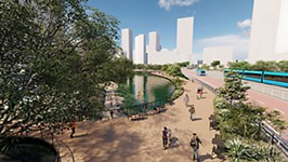
O'er on yon southeastern shore, near where the lake becomes a river again, what was a low-density landscape has become the strenuously emergent East Riverside Corridor. While the ERC has a master plan and regulating plan, the individual developments within it – the South Shore District, the Lakeshore, and soon the 4700 Riverside mega-project, aka the Domain on Riverside – are all distinct, thank you very much, with their own branding and at least the rudiments of wayfinding systems, mostly to get you to sales and leasing centers. Right now, as they compete with each other for residents, retail tenants, and customers, their brand differences matter a lot more within the corridor than they do to outsiders, and certainly more than they will once the ERC is all built out, perhaps around a Blue Line, a decade or two hence.
One fixture that may even still be around by then (JK?) is the Oracle campus that anchors Lakeshore, which has a signage and wayfinding program developed by Austin's Asterisk Group. Unlike your typical Silicon Valley (or Northwest Austin) corporate campus, Oracle is not completely surrounded by lawns and its own roadways; its exterior signage and wayfinding has to both shepherd motorists into its entry plaza (1) (off Lakeshore Boulevard) and parking garage, and guide pedestrians (2) ambling over from the mixed-use streets around it. The system is coordinated from the largest to smallest elements, Asterisk says, to "meet client-provided goals for clarity and efficiency" and "complement the building's sleek and polished architectural aesthetic (3)." Though Oracle has a well-established brand, the wayfinding system builds upon it with elements such as the informational signs around the grounds (highlighting, among other things, sustainability features) and the coding of the parking garage levels not just by color but also with iconic representations of Austin landmarks.