Life's Enriched Pageant
Graphic Design and the People Who Commit It
By Wayne Alan Brenner, Fri., Sept. 8, 2000


The ink is black, the page is white.
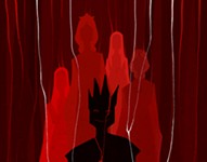
Centered within two columns of text, because it's an article about auto accidents, there's a full-color photo of a Mazda rammed into one of the thick supporting poles of a billboard, a young man halfway through the shattered windshield, the side of the young man's head and neck opened in a wide gash that flows darkly onto his shirt and puddles across the car's compromised hood. The photo's all grayscale, except for the blood: The blood has been printed as red as it must have been when it left the body.
Accidents happen. Articles, and the way they look, are designed. But then, everything on this planet that doesn't occur without human intervention is designed -- to some degree. Sometimes the design is useless or sloppy, sometimes it's as precise and effective as a laser. Sometimes the design serves corporate or public interests, sometimes personal and private desires, sometimes both. But good design, like good air, always helps you breathe a little easier -- whether in relief through information well communicated or in sheer joy through aesthetic pleasure.
This is an article about a few of the people in Austin who make a living as designers -- graphic designers. And -- not quite to spite the ubiquitous and raucous championing of anything high tech -- we're going to focus on those who work in other than multimedia. Who work in print, especially.
The people and companies featured below constitute no "best of" listing necessarily, nor were they chosen by ... well, by design. Rather, your reporter simply made note of Some Really Neat-Looking Stuff in his quotidian life, did a little research, and found out who had created that Stuff; he also checked the yellow pages and chose a few names at random, or chanced upon a serendipitous link online and worked from there. Add the limits of available space, the restraint of written language, the necessity of illustration, and this is the result.
Marc English: Design
Marc English, rock star. That's the impression you get after only a few minutes with him. The boldness and certainty with which he talks, with which he moves, the way he proceeds through a series of intricately linked jump-cuts while rhapsodizing about his work and the work of respected others. He's enthusiasm embodied, this tall guy in denim pants and white shirt, and his energy is backed up with a deep knowledge of design and its history. He's had classes in it (BFA from the Massachusetts College of Art), he's taught classes in it (as adjunct professor at his alma mater, and Southwest Texas State University, and elsewhere), he's even written an instructive and entertaining book on it (Designing Identity: Graphic Design as a Business Strategy). But he's been interested in the field for a much longer time.
"I got this album when I was 10 years old," he says, holding up a copy of the Beatles' Revolver, the album covered with finely lined pen-and-ink portraits of the Fab Four. "The cover's by Klaus Voorman, a German who hung out with the Beatles in Hamburg. And when I was a little kid, I was holding the album while listening to the songs over and over and over again -- which is what you do when you're that age. And I'm looking at these illustrations and the photographic collage, and it's great. And then I'm in junior high and I can take my bicycle into Harvard Square -- it's a little Stingray bike -- and ride around and look in the record stores. And right next to the records are the books -- the art books. And I see line drawings by Aubrey Beardsley much like the Revolver cover, and naked girls -- and where else can you see, y'know, bare breasts in junior high and get away with it but in art books? And years later, I realized that the Beardsley stuff came from the influx of Japanese art into the West during the 1800s -- when Beardsley was around. And I didn't know that back then, when I was 10, of course. But that's how I first got into it -- from looking at my Beatles albums. The White Album with its embossed cover. Sgt Pepper's. So I -- " he laughs, shaking his head " -- I owe everything to John, Paul, George, and Ringo."
English did the whole rock & roll thing himself for years, after high school, attending the Berklee College of Music in Boston and playing in a series of low-impact bands. Eventually, he burned out. "I didn't feel like starving anymore," he says. "I saw too many people doing that kind of thing, the whole band living together in one house with a big box on the floor, two feet by two feet, filled with elbow noodles." So back he went to visual art.
Fast forward through the college years and past them: through stints as president of the Boston chapter of the American Institute of Graphic Art (AIGA); through almost two decades of graphic creations to promote the likes of Laurie Anderson, Houghton Mifflin, VTEL, Hoodoo Barbeque, Sun Microsystems, and locals Cinemaker Co-op, AIDS Services of Austin, and others; through the resultant citations and awards for excellence in design; through -- on the personal side -- a marriage and divorce that's left him with, at least, a Texas address and a wonderful daughter to share the cool things of the world with.
These days, English is hard at work in his studio on Goodrich Avenue. Well, he's taking some breaks -- to speak at various symposia (he's on the national board of the AIGA, after all), to attend art openings (he has an upcoming exhibition of his work at the Universidad Autonoma Metropolitana in Mexico City), or just to explore different parts of the world (like Morocco and Tangier, where he recently experienced and photo-documented the culture once inhabited by his literary idol, Paul Bowles). More often, though, he's at the drawing board, even literally, conjuring light and shadow, paper and pen, mouse and software, in ways that result in stunning design for all manner of public and private endeavors. He's just completed an annual report for XeTel Corporation -- vividly full-color, with multiple die-cuts and intricate production manueverings -- and he's working on new identity systems for GirlStart and the Austin Film Society, not to mention hammering out a deal with an international aeronautics company that ...
Well, he's doing what he does best. His Cormac McCarthy poster for Texas Writers Month matches, in intensity and lyricism, the blood-soaked text it illuminates. His work for the Salvage Vanguard Theater production of David Bucci's Altamont Now -- the main image is English's own booted foot stepping on the wrist of his young daughter, flowers falling from her opened hand -- is something memory won't soon release.
And English is not unwilling to go on about these things. There's little humility from him, false or otherwise, but neither is there any lame boasting. Nor is this former Bostonian reticent on the merits of others; he holds the work of David Kampa and D.J. Stout in such high esteem, for example, that those men would likely be his heroes if they weren't already his friends. And the idea that his work will soon be shown in Mexico City, in the same place that's exhibited the work of Paul Rand, makes him grin like a fiend. He's glad to point out what works locally, too, as far as corporate identity is concerned: The Ace Custom Tailors sign, the logo for the new airport, the Taco X-press storefront on South Lamar. (Maria's Tacos, he calls that last. "My studio used to be across the street from them; I used to walk there all the time for lunch. Now it's so crowded, you can hardly find a place to eat. But you know what? I've got the sign they used to have, the old one. It's in my kitchen at home.")
All perfect embodiments of what those companies do and how they do it, sayeth the Design Shaman. "And Waterloo Ice House on 38th," he adds, gesturing to the north, his wrists obscured by various bands of silver, of copper, of finely wrought metal. "They've got those canoes. A row of canoes upended, way off the ground, cut in half, bright colors inside. All these things, the signs and other elements that talk about what's going on in a place and who the customers are -- it's a visual language. And that's what we keep going back to."
Sure, but what if that language is ill-used? "I'll tell you," says English. "We have a client -- who I won't name -- and their logo sucks." He frowns, as if the offensive item has just materialized before him. "It really sucks, and we didn't do it. And you talk to them, and they don't understand why it sucks, but the attitude seems to be 'Well, it's worked so far ... ' And to me, that's not good enough. If you want to differentiate yourself, you have to be superlative. And you have to be superlative not only in your product, but in your promise -- which is the signage and other visuals, the graphic identity that provides first impressions to your audience. If design is going to succeed in communicating, in product packaging, it's got to add something more. It's got to add something that enhances life."
Hovis Design
Matt Hovis looks like a bike messenger. Young, kind of scrawny, but aerobically strengthened, the sort of guy you could see tear-assing down Congress on a custom Cannondale with Fatboy Slim thumping through his Walkman as he attempts to beat the deadline on some important delivery. What Hovis actually delivers, though -- what he runs a swiftly growing company that specializes in delivering -- is graphic design. You can see his handiwork all over this Live Music Capital of the World. From CD covers for Don Walser and Sixteen Deluxe to logos for Ariel Dance Theatre, Maverick Media, and the Rude Mechanicals, to designs for Club DeVille, Little City, and Lucky Lounge, all the way to private collections of the late, lamented 15 Minutes broadsheet.
"15 Minutes was a great design platform for us," says Hovis, gazing off the balcony of his downtown headquarters. "We'd just stay late one evening after work and crank an issue out of whatever the editor, Benjamin Serrato, gave us. So there was that one-night restraint, and we had to learn to work within that. So whatever our first idea was, it'd go into press. It was fun for [business partner] Kevin [Whitley] and I, it was good to get our collaborative machinery working, and it taught us how to do interesting things within a small budget. It was a two-color job, and we learned how to manipulate the two-color process to do weird things, to kind of abuse the graphic standards."
Hovis studied painting and sculpture at UT years ago, but that's not precisely where he learned the standards he would later abuse to gorgeous effect. "I didn't know anything about graphic design at the time, I'm not even sure I totally understood what it was -- commercial art or advertising work." He shrugs, sort of half-smiles. "But a lot of the professors told me my paintings were graphically strong and asked if I did any design work. I didn't know what they were talking about. Then I graduated and went straight into the film business as I'd always planned, but I just missed making images, making visual art. So I looked into it -- into graphic design. And I told a friend of mine I was looking into it, and he said he'd seen an ad on a UT bulletin board, that somebody was looking for a graphic designer. So I called the number and made an appointment to be interviewed. I brought in a portfolio of paintings and sculpture, and for some crazy reason they hired me.
"This was about eight years ago, like 1992. I had to run out, borrow money, and get a computer -- and I didn't know how to use one, I had to get a whole bunch of books. And that first project was the parks and recreation master plan for the city of Birmingham. Which would be kind of a big job for us now, y'know?" Hovis laughs, grinning until faint crow's-feet mark the outside corners of his bright eyes. "It was hilarious," he says, still laughing. "It was so trial-by-fire. But I was into it, y'know? It was a graphic representation of their whole master plan, with all these maps and stuff, kind of like an annual report without all the financial data -- like a big brochure that explained the plan. I had no business doing that; they were complete fools for hiring me. But it went well, it went really well. But it wasn't until I did Little City and some other cool small shops around here that I really felt like I understood what I was doing."
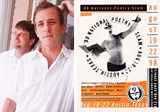
By now Hovis has a brace of cool projects under his corporate belt. Among them: Changos, Big Red Sun, Cush Cush, and the National Poetry Slam campaign. "That Slam project was fun," he recalls. "We came up with that character, El Poeta, and went over to Bruce Dye's studio to shoot a commercial. The poster ended up being the most published thing we've ever done, and it suits our style real well. A lot of our clients now, it's different, a lot of them are real big tech companies."

One of the things such companies demand is media beyond print. Which in turn demands more than just one designer, no matter how resourceful that designer may be. "I was working solo for a few years," says Hovis. "Then Kevin Whitley joined me, and it was just the two of us. And we were getting bigger clients and projects with bigger needs, so we started a production company, doing films and video, a little over a year ago. It's called Action Figure, and now the two companies -- Action Figure and Hovis Design -- are merging. And we've got, like, 13 people. It's grown a bit more than I ever planned on, but it's getting more and more interesting, so it's hard to slow down. We just recently did a lot of animation, a lot of interface design, for that godawful Sandra Bullock film."
Miss Congeniality may not be far enough off the beaten path for this Austinite, who prefers things a little freakier. "I came into design through the back door, as a place to create imagery, to be a little bit subversive professionally, in terms of trying to get some really interesting things by people who weren't necessarily asking for it. It wasn't so much for the love of the practice of design -- although I've come to love that now. It was ... it was a playground for making weird shit.
"Random things have always been what inspires me," says Hovis. "Imagery that wasn't intended, signs that are damaged in ways that have taken on another meaning. I have a pretty bad reaction to a lot of corporate communication. Absurd, accidental imagery is sort of where I get jacked up. You don't want to do the same thing over and over again, to fall into some kind of rut. You look at a lot of advertising today, especially on television -- a lot of those ads are totally surreal. It's hard not to watch them, and isn't that supposed to be the point? You want to get your idea across, whether it's selling software or a nightclub or a theatre company ... and you can't do that if people aren't paying attention, if the design's boring. That's not what people want; people want to be freaked out." Luckily for this profitable rebel, corporate giantism doesn't always equal blandness.
Sometimes, things couldn't be much better. "We're doing a lot of media work for Tivoli," says Hovis. "They're one of our main clients, we do all their films and video. And for a corporate client, they let us get away with murder -- we do some really weird stuff." He pauses for a moment, staring into the stuttered distances of the city. "But, y'know, we're finding that more and more companies want that. And that's what we're supposed to do, anyway: to try and extract what's interesting about these more corporate environments. To show them just how interesting they can be -- and how they ought to stop trying to avoid being interesting."
Graphic Granola
Okay, so Graphic Granola sounds like some kind of hippie organization, and its creative co-director, Kelly Blanscet, looks a lot like some kind of organized hippie. Her designs, though, cut enough edge to satisfy any number of multiple-pierced skate punks doing ollies and fakies and Immelmans off the battered marble and chrome of downtown bank buildings. You might imagine some of those skaters wearing Dickies -- the longtime workman's clothes now repositioned as turn-of-the-century industrial fashion -- and that would make sense on several levels, since Blanscet designed most of the graphics for the recent Williamson-Dickie 75th Anniversary line of apparel.
That was when she worked in-house at Dickies, up in their Fort Worth headquarters. "They let me dig through all the old archives," says Blanscet, opening her portfolio, revealing her colorful wares. "Decades of pictures and correspondence, old testimonial letters from customers, reports and advertising, anything I wanted to incorporate into the design. Old clothing patterns, like I've used in the background here. Stuff like this," she says, pointing at the photo of an old-timey military-looking gent in one of the promotional brochures she created. "That's Colonel Dickie," she explains.
Heavily retro graphics abound in this identity system, in the ads and tags and point-of-sale material, until you reach the newest garment offerings; then the visuals assume a sort of Russian-Constructivism-meets-Raygun feel and the type looks like it was arc-welded into the wall of an old elevator. Or like the type was bleeding and now it's been ... cauterized, somehow. Not exactly what you'd expect from a studio called Graphic Granola.
"Well, I like things that are kind of gutsy, on the edge," says Blanscet, shrugging. "Most of Austin, besides the high tech field, has a kind of funky look about it, which I really like. A lot of the fliers I see for bands playing around town -- they just seem to have so much more fun, to really cut loose. I like that, and I think people in general like it, too."
This is an industry agreement; but then, it's the agreement -- that's at least given lip service -- in every type of industry: that the work has to be better than ordinary. The particular interpretation of better-than-ordinary will vary, of course, presenting as elegant or funky or downright disturbing. But it has to stand apart from the crowd.
"You're trying to communicate something to people," says Blanscet. "A message, an action, even an emotion. And when it works well is when it's evoking a response, which can be laughter, a sense of trust, or -- the ultimate goal in commercial ads -- action to buy something. That's when it's doing its job. Although, as a designer, when I see something great it usually goes in my head and right back out, you know? But when I see something that's suffering, that's when it sticks with me. I'm like, 'Okay, I need to get in touch with these people, they really need some help.' Like Texas.net: That logo has got to go! But they're, they're married to it, they won't get rid of it. I think they recently tried to make it even more Seventies and cheesy-looking, and I just don't understand it.

"And you know what I'm really tired of?" she asks, building up steam. "I'm tired -- especially with all these high tech companies -- I'm tired of seeing a little orbit around every name, a little ellipse. It's everywhere! Everybody's got to do that!" She scowls. "Can't they just let it go? You see it all the time, and I mean, jeez, you can say 'global' or 'high tech' in other ways. There's a whole litany of iconic ideas out there, people, and it's time to move on. It's time to cut loose."
Blanscet herself cuts loose in much of her work; as loose as her clients will allow, anyway. "This is a postcard campaign for a direct-marketing association in Dallas/Fort Worth," she says, by way of illustration. "It shows what you have to do to succeed in the field, and my concept was like Maslow's Hierarchy of Needs -- but for a direct marketing business." She displays the series of cards: glossy, full-color bleeds; eye-grabbing images above, single-word white titles on black below. "See, first you have to Survive." Bulletholes in a red metal wall. "Then you need to Adapt." Zebra skin -- but one off-center stripe is blazing pink. "To Grow." An enormous daisy against dark green grass. "To Evolve." The fossilized imprint of some Pre-Devonian fish. "And you have to Integrate." The previous titles floating near each other, backlit, upstaged by the letters DMA. "But,"says Blanscet, "that was just the first version. And someone got offended. We had a whole committee deciding what would work, and one of them was offended. So we had to change the bulletholes, which they thought were too violent, to a bunch of broken eggs." She pulls an incredulous face. "A bunch of splattered embryos? That's not too violent?"
And what of Blanscet herself, and the other creative co-director, G.G.'s copywriter David Bonner? Will they survive? Or will they eventually fold, sustaining themselves with safer day jobs and reveries of design triumphs past -- like the work Blanscet did for Bike.com the first time Lance Armstrong won the Tour de France? Or will they be able to make it in the complex economic food chain that Austin is becoming? Is there still room for granola, even savvy and inventive granola, among all the bright new carnivores and their meat?
"I tried to work on my own when I first moved here," says the designer, pushing back a few strands of her long blonde hair, "but I didn't really have the connections then. So I worked at JH&A Advertising, I worked at Jolly Design, at Rushing Advertising, and eventually found myself at Nourzads. And in April of this year, I finally decided, 'Okay, I'm gonna do this.' And I did."
But what about five months, even five years, down the road? Will Graphic Granola be around then? "We'll survive," says Blanscet, nodding. "And we'll prosper. I'm sure of it. There's so much going on in this town, now. All the things that make the traffic really horrible, the other bad stuff, it's made business a lot easier to get, these days. Everything I've done so far was by referral, and we're already doing great. So if I aggressively went after new business, I can just imagine: I'd have to start adding staff." She looks at her partner and grins. "Which sounds good to me."
Nsomnia: R.I.P.
On the other hand, not everyone can make a go of it.Three years ago, Scott Petrie and Michelle Tullis, two designers previously working for separate studios, decided to form a new company. They'd make a living from it, was the idea. They'd create innovative, envelope-pushing designs, they'd bust their artistic chops and burn more than daylight in rendering the finest projects they could imagine. They'd generate print ads, animation, identity systems, Web sites, shopping bags, whatever it took. And, as their multiple Addy awards attest, they weren't just another couple of wannabes: If these two are lousy with something, it's probably talent.
You need evidence yourself? Go to Fifth and Lamar, check out the Jackson/Ruiz salon, scope out its cunning logo; go on inside, ask to see the company stationery; go ahead, check it out -- it's another Nsomnia design, they handled the whole system, and it's beautiful. Or think about that Metropolis apartment complex. Maybe you don't know anyone who lives there, maybe you've never been, and maybe that's why it's even more fascinating to you -- especially after all those striking ads for the place. You really liked those ads, didn't you? That's Nsomnia again. And who do you think designed and animated that logo for Mangia Pizza, eh?
Right. So what happened?
"Basically, word of mouth only goes so far,"says Scott Petrie. He's lunching at The Clay Pit, where he knows the waiter. He knows the manager and the owners, too. Of course he does -- their Web site was designed by Nsomnia. Now the Clay Pit Web site is still up and running, but Nsomnia, let's say it again, is gone.
"We were making a profit," says Petrie around a bite of Murg Vindaloo. "We were making a good living. But -- when does that dry up? When does the word of mouth dry up? To be successful, you have to have a salesperson, somebody to sit there and call and call and get you jobs. And we didn't want to get a salesperson, and we didn't want to do the sales ourselves -- because then you have to take what you're given. And our whole thing was quality work, it had to be above average, and we never compromised that. We picked and chose all of our clients. It was like, 'Okay, if we're gonna work for you, these are our requirements, and if you don't like those requirements, we're not gonna do the job.' And we never really had any problem with that, the only thing we ran across was people who didn't want to spend the money. But that goes hand-in-hand with everything else. So, basically, we shut down because our jobs -- our agency -- was too hard to sustain because of the work ethic we had."
A moment of silence, if you will. (Kelly Blanscet, please take note.)
And now we're back to that car crash photo again. The way it looks has been suggested with words -- and not even words from the text that we imagine surrounds the photo. Ultimately, the way that image looks has been created by the graphics team in your head; they're almost helplessly filling in what's missing from the text: the model and condition of the wrecked Mazda, the general size and color of the young man sprawled lifeless across its hood, the style of clothing upon what is now a stiffening corpse, the angles of repose reached by the arms, the legs, the glistening puddles of blood. And what about the illuminated billboard that the kid's crashed into one thick leg of -- what's up there now, larger than life, screaming its message across the sky, jarring the rods and cones of an entire city's eyes? Is it an ad for a car dealership, a new brand of snack cake or Internet portal, a fundraiser for some deserving charity, an especially sleazy strip joint? Who created the images for it? Who the hell chose the typefaces and the colors and arranged all the varied elements within that one oversized rectangle? Somebody did -- you can be sure of that.
Don't ever think this stuff just happens. ![]()